


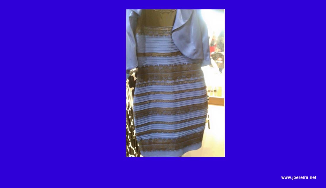
The phenomenon of the dress that some people perceived as white and gold and others as blue and black was one of those viral episodes that, despite originating from an apparently trivial image, ended up raising much more complex issues related to perception, tonal reproduction, and color management.
The discussion was initially posed as a simple question: determining the “real” color of the dress. However, that question was not enough to explain why different observers could look at the same image and describe it in such different ways. The interest of the case lies less in the garment itself and more in the photograph: an image with ambiguous lighting cues, viewed on very different screens and environments, forces our visual system to make decisions about how to interpret what it sees.
It is not, therefore, that some observers have defective vision or that others possess a special ability to identify colors. Color perception depends on the light we assume is present in a scene, the environment from which we observe, our visual adaptation, and the information available in the image itself.
Photography and its tonal reproduction
The widely circulated image of the dress presents unclear tonal reproduction. The bright areas appear washed out and the environment does not offer sufficient references to confidently determine the lighting of the scene. In a well-exposed photograph with an unequivocal color reference, it is easier to separate the properties of the object from the properties of the light illuminating it. Here the opposite occurs: the available information leaves several interpretations open.

This does not allow us to assert, without having the original file and its processing history, that the photograph was the result of a specific automatic white balance or a particular correction. The published file may have passed through a camera, an application, a social platform, a screenshot, or subsequent editing. Each of these stages can alter the final appearance of the image.
Overexposure, a chromatic cast, or poor tonal conversion can influence the appearance of the dress, but they alone do not explain the radical difference between observers. That difference is related to how the visual system resolves an ambiguous scene.
Color constancy and inferred illumination
Human vision does not record color as if it were a measuring instrument isolated from context. When we look at a surface, our visual system automatically tries to separate the light illuminating the scene from the inherent properties of the object. Thanks to this mechanism, we can recognize a white sheet both under the warm light of a domestic lamp and under bluish outdoor lighting.
This process is generally known as color constancy. It is not perfect, nor does it work the same in all circumstances. When an image offers insufficient information about the illuminant, the observer must infer which type of light is most probable: cold light, shadow, warm illumination, or a neutral scene.
In the case of the dress, some observers seem to interpret that the scene is dominated by bluish lighting or shadow. By mentally discounting that bluish component, the dress can be perceived as white and gold. Other observers infer warmer lighting and, by compensating differently, perceive the dress as blue and black.
The difference is not a simple matter of nomenclature. Studies conducted after the phenomenon’s spread found stable perceptual categories, mainly white/gold and blue/black, as well as a third blue/brown response in some participants. They also showed that assumptions about illumination weigh more than simple demographic factors such as age or gender.
Chromatic adaptation and viewing conditions
Chromatic adaptation participates in this type of phenomenon, although it should not be considered the sole explanation. The visual system gradually adapts to the lighting and environment it has been observing, so the same stimulus can appear different after exposure to a cold, warm, dark, or very bright scene.
The background surrounding the image, screen brightness, and ambient light can influence perception. A predominantly blue interface or a page with warm tones can modify the context in which the photograph is interpreted. However, it cannot be deterministically stated that a blue background forces the dress to be seen as white or that a warm background makes it perceived as blue. These are factors that can modulate perception, not an automatic solution to the problem.

Luminance of the environment also plays a role. The appearance of an image depends not only on its pixel values but on the relationship between the screen and its surroundings. A monitor used in a dark room, a phone screen viewed outdoors, or a laptop with maximum brightness do not necessarily produce the same visual experience.
Similarly, reproduction size modifies how we attend to the image. A photograph viewed on a large screen allows appreciation of certain contextual details, while the same image reduced to a phone screen focuses attention on the dress and may reinforce its ambiguity.
Color management and devices
Color management is relevant but should not be presented as the central explanation of the phenomenon. ICC profiles, monitor calibration, and proper color management in an application help reduce differences between devices, although they do not guarantee that all observers experience an identical appearance.
The photograph of the dress circulated in multiple versions: downloaded images, screenshots, social media posts, and reproductions viewed on screens with very diverse configurations. Along this path, color space conversions, compressions, contrast changes, or modifications introduced by the platforms themselves may occur.
However, even with technically stable reproduction, lighting ambiguity would remain relevant. Color management helps control signal reproduction; color perception also depends on the observer, the scene, and the context from which observation is made.
Therefore, it is not appropriate to equate a camera’s white balance with human visual adaptation. The former is a transformation applied to image data according to an algorithm or selected setting. The latter is a complex, partial, and context-dependent perceptual process by which the visual system attempts to maintain stable appearance of objects under changing illumination.
Standardized conditions and color evaluation
When it is necessary to evaluate color reproduction with technical criteria, it is not enough to open an image on any screen and make an immediate judgment. The device, its profile, luminance, ambient lighting, and visual environment must be controlled.
Observation condition standards exist precisely to reduce these variables in the evaluation of graphic and photographic materials. The current ISO 3664:2025 establishes conditions for critical viewing of prints, transparencies, and reference objects. It does not constitute a direct solution for a viral photograph viewed on uncontrolled screens but reminds us of an essential issue: color appearance cannot be separated from the conditions under which it is observed.

In a professional workflow, the screen must be calibrated and characterized, the environment must be kept under control, and ambient lighting must be consistent with the intended use of the image. In everyday practice, these conditions are rarely met, so it is expected that an ambiguous image will be interpreted in different ways.
The dress as a case study
The interest in the dress is not in deciding which group of observers was right and which was wrong. Its value lies in showing that color is not a property we can read in isolation from the numerical values of an image.
A photograph records a pixel distribution; vision interprets a scene. Between these two intervene illumination, chromatic adaptation, prior experience, observation context, and the visual system’s ability to formulate a hypothesis about what it is seeing.
Under ordinary conditions, these inferences allow us to recognize objects relatively stably. In an image poor in lighting references, such as the dress, the mechanism can lead to different and coherent interpretations for different observers.
Far from being an anecdote without interest, the phenomenon illustrates why color management, photography, and image visualization must be treated as complete processes. It is not enough to capture, edit, or display an image: one must also consider under what conditions it will be observed and what information it provides so that the viewer can interpret it.
References
- Lafer-Sousa, R.; Hermann, K. L.; Conway, B. R. “Striking individual differences in color perception uncovered by ‘the dress’ photograph”. Current Biology, 2015. Abstract and bibliographic access.
- Brainard, D. H.; Hurlbert, A. C. “Colour Vision: Understanding #TheDress”. Current Biology, 2015. Abstract and bibliographic access.
- Wallisch, P. “Illumination assumptions account for individual differences in the perceptual interpretation of a profoundly ambiguous stimulus in the color domain: ‘The dress’”. Journal of Vision, 2017. Abstract and bibliographic access.
- ISO 3664:2025. Graphic technology and photography — Viewing conditions. Standard sheet.